

Exploring how an open-source design tool, the Model Context Protocol, and AI can collapse the gap between design and development.
Introduction
In today’s fast-paced digital world, design tools play a crucial role in shaping user experiences. While platforms like Figma and Adobe XD dominate the landscape, a new contender is steadily gaining attention — Penpot.
Penpot is an open-source design and prototyping platform built for cross-functional teams. Whether you’re a designer, developer, or product manager, it provides a truly collaborative environment without the constraints of proprietary tools.
Curious about its potential, I explored how Penpot could go beyond design. This led me to experiment with integrating it with an MCP (Model Context Protocol) server to enable AI-driven code generation directly from design files.
In this blog, I’ll walk through what Penpot is, how MCP fits into the picture, how it stacks up against Figma, and how I implemented a workflow that transforms design concepts into working code.
What is Penpot?
Penpot is a web-based, open-source UI/UX design platform built for cross-functional teams.
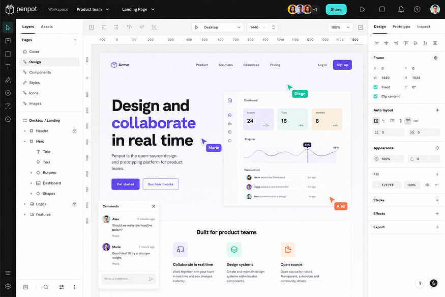
At first glance, it feels similar to other design tools. But what makes it different is what’s underneath:
- It’s fully open-source (MPL-2.0 licensed)
- It can be self-hosted on your own infrastructure
- It’s built on web standards like SVG and CSS
- It uses Flex and Grid layout systems that mirror how the browser actually renders interfaces
From a developer’s perspective, this is a big deal. Instead of treating design as something separate, Penpot brings it closer to how interfaces are actually built in the browser.
Why Penpot? Advantages Over Figma
After Adobe’s pivot around Figma and the steady rise in subscription costs, many teams are re-evaluating their design stack. Here’s where Penpot pulls ahead:
1. Open Source & No Vendor Lock-In
Penpot is open source and released under the MPL-2.0 license. Your designs live in open SVG-based formats, not a proprietary binary that traps you in one ecosystem. If you leave the platform, your files come with you — readable in any text editor.
2. Self-Hosting & Data Sovereignty
For regulated industries (finance, healthcare, government, defense), the ability to deploy Penpot on-premise or in a private cloud via Docker is a non-negotiable advantage. Figma is cloud-only. Your design IP never leaves your perimeter with Penpot.
3. Web-Standard Layout System
Penpot’s layout engine is built around Flexbox and CSS Grid — the same primitives developers use. This means the design is the code’s blueprint, not an approximation of it. Figma’s auto-layout, while powerful, doesn’t map 1:1 to CSS.
4. Cost Predictability
Penpot is free on penpot.app and free to self-host. Figma’s pricing varies significantly depending on the plan and organization size. Enterprise plans can reach higher per-seat costs, while Professional and Organization plans are typically priced lower. For teams managing many seats, subscription costs can still become a significant factor compared with self-hosted open-source alternatives like Penpot.
5. Developer-First Handoff
Penpot exposes clean SVG, CSS, and HTML in its inspect panel. There’s no “designer dialect” to translate — what the designer sees maps directly to what the developer ships.
6. AI-Ready Through MCP
This is the feature that made this experiment possible. Penpot’s open architecture makes it easier to explore AI workflows because designs can be self-hosted, inspected, and extended without depending entirely on a proprietary ecosystem.
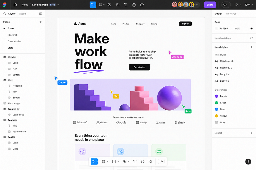
Figma has also introduced official MCP support through its Dev Mode MCP server, making AI-assisted design workflows possible there as well. The difference is not whether MCP exists — it is the level of ownership, openness, and control developers have over the surrounding ecosystem.
7. Plugin & API Openness
Penpot’s plugin system and open REST API let you extend the tool without going through a corporate review process or app store.
Detailed Comparison: Penpot vs Figma
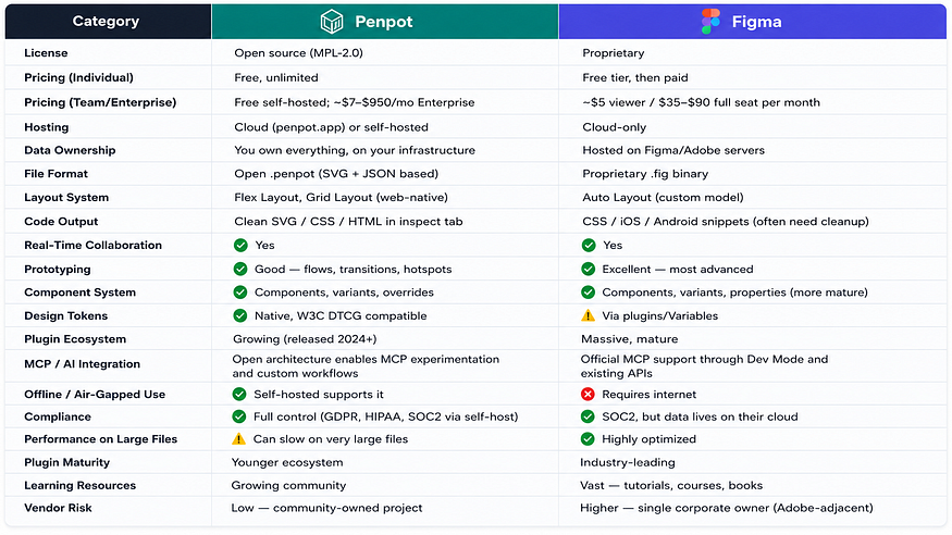
Bottom line: Figma still wins on polish, plugin breadth, and prototyping depth. Penpot wins on freedom, ownership, web-native fidelity, cost, and AI-readiness.
Understanding MCP: The Missing Link
The real shift in this experiment happened when I introduced MCP into the workflow.
MCP (Model Context Protocol) is an open protocol that lets AI systems interact with external tools in a structured, permissioned way. Instead of an AI working with vague inputs or screenshots, MCP allows it to:
- Access real, live data sources
- Execute scoped, well-defined operations
- Receive structured, predictable outputs
In simple terms, MCP is the bridge between tools and AI — think of it as USB-C for AI agents.
What is the Penpot MCP Server?
The Penpot MCP server allows AI agents (Claude, ChatGPT, Cursor, and any MCP-compatible client) to:
- Access Penpot design files
- Read components, layers, and layouts
- Extract design tokens (colors, typography, spacing)
- Automate design-related workflows
- Plug design directly into development pipelines
It essentially turns Penpot into an AI-accessible design backend.
Turning Penpot into an AI-Readable System
When Penpot is connected to an MCP server, something interesting happens. Design files are no longer just visual artifacts. They become:
- Structured data
- Queryable information
- Machine-readable context
This means an AI model can:
- Read layout hierarchy
- Extract components and their variants
- Understand styling and tokens
- Access text content and copy
At this point, the design is no longer something you look at — it’s something you can work with programmatically.
Architecture: How the System Actually Works
The architecture below shows how a design moves from canvas to production code:
┌──────────────┐
│  Designer    │
│  (Penpot UI) │
└──────┬───────┘
       │ creates UI
       ▼
┌────────────────────────┐
│   Penpot Design File   │
│   (SVG + JSON)         │
└──────────┬─────────────┘
           │ REST API
           ▼
┌────────────────────────┐
│   Penpot MCP Server    │ ◄── exposes design as
│   (Model Context       │     structured tools
│    Protocol)           │
└──────────┬─────────────┘
           │ structured JSON
           ▼
┌────────────────────────┐
│   Snapshot Store       │ ◄── stable, debuggable input
│   (local JSON cache)   │
└──────────┬─────────────┘
           │ context
           ▼
┌────────────────────────┐
│   AI Model             │
│   (Claude / GPT / etc) │
└──────────┬─────────────┘
           │ generates
           ▼
┌────────────────────────┐
│   React + CSS          │
│   Components           │
└──────────┬─────────────┘
           │ review & refine
           ▼
┌────────────────────────┐
│   Developer            │
│   (manual polish +     │
│    integration)        │
└──────────┬─────────────┘
           │ merge
           ▼
┌────────────────────────┐
│   Production Codebase  │
└────────────────────────┘
Note: The snapshot store shown above is a custom component added in this workflow. It is not part of the Penpot MCP server itself. I introduced it to create a stable, reproducible layer between design extraction and AI generation.
Layer Responsibilities
LayerResponsibilityPenpotSource of truth for visual design — stores, organizes, and versions design filesMCP ServerTranslates Penpot’s API into AI-consumable tools and resourcesSnapshot StorePersists structured design data as JSON for reproducibility and debuggingAI ModelInterprets the structured context and produces codeDeveloper ReviewFinal polish, accessibility checks, integration into the codebase
What I liked most about this setup is its simplicity — each layer does one job, and does it well.
From Design to Data
The first step in the workflow is creating the UI in Penpot. This sounds straightforward, but it turned out to be one of the most important parts of the entire system.
👉 The cleaner the design structure, the better the output.
Things that made a big difference:
- Clear, semantic layer naming (
PrimaryButtonnotRectangle 47) - Logical hierarchy that mirrors component composition
- Reusable components instead of duplicated frames
- Consistent use of design tokens instead of hard-coded values
Good design here directly translates to better code later. Garbage in, garbage out applies as much to AI code generation as it does to data science.
Extracting Design Through MCP
Instead of exporting images or inspecting designs manually, I used MCP to extract structured data:
- Layout details (position, size, constraints, type)
- Design tokens (colors, typography scales, spacing)
- Component metadata (variants, props, overrides)
- Text content
What stood out here was how different this felt compared to traditional workflows. Instead of guessing from visuals, I was working with precise data.
Why Snapshots Made Everything Easier
One decision that made a big difference was storing each design as a JSON snapshot.
At first, it seemed like an extra step — but it quickly proved useful:
- Debugging — when output was wrong, I could inspect the exact input
- Reuse — the same snapshot could feed different generators (React, Vue, Svelte)
- Separation of concerns — extraction and generation became independent stages
- Predictability — the AI got stable, deterministic input every time
This pattern (snapshot → generate) is borrowed from data engineering, and it’s one of the strongest design choices in the pipeline.
Feeding Structured Data to AI
This is where things started to get interesting.
Instead of sending screenshots to an AI model, I passed structured data:
- Layout hierarchy
- Design tokens
- Text elements
- Component metadata
The difference was immediately noticeable. The AI didn’t have to interpret the design — it already understood it.
And because of that, the generated code was:
- More accurate
- Better structured
- Easier to work with
- More consistent across screens
Generating Code That Actually Works
Using the structured input, the AI generated frontend code — primarily React components — that included:
- Proper layout structure (Flex/Grid mirroring the Penpot design)
- Styled elements using design tokens
- Semantic HTML (
<button>,<nav>,<article>, not<div>soup) - Reasonable accessibility attributes
In many cases, the output was surprisingly close to production-ready. It wasn’t perfect, but it removed a huge amount of repetitive work — the kind of boilerplate that drains developer energy without delivering creative value.
Where Humans Still Matter
Even with automation, I deliberately kept the human step — and that turned out to be important.
The workflow still includes:
- Reviewing generated code for correctness
- Making small adjustments (state, edge cases, business logic)
- Accessibility audits
- Integrating components into the broader project
This balance works well:
👉 AI handles the heavy lifting. Humans handle the final refinement.
Why This Approach Works So Well
Speed
The time required to convert design into code dropped significantly — often from hours to minutes per screen.
Consistency
Since code is generated from structured design data, colors stay consistent, typography stays aligned, and layouts don’t drift between screens.
Collaboration
Design and development no longer feel like separate phases — they become part of a continuous workflow.
Scalability
Once the pipeline is in place, processing multiple screens or maintaining design system parity becomes routine, not a heroic effort.
What Didn’t Work (and What I Learned)
Like any experiment, this came with challenges.
- MCP setup — getting everything running smoothly required careful configuration of credentials, transport modes, and access tokens.
- Design complexity — nested layouts, unclear naming, and unusual structures caused issues. Clean designs produced clean code; messy designs produced messy code.
- AI limitations — the model sometimes hallucinated when input was ambiguous. The fix was always upstream: improve the design, not the prompt.
The biggest realization:
👉 The quality of output depends entirely on the quality of input.
The Biggest Insight
If there’s one thing this experiment made clear, it’s this:
👉 Design is no longer just visual — it’s data.
And once design becomes data:
- It can be processed
- It can be automated
- It can be transformed into code, documentation, tests, or accessibility audits
That changes how we think about UI development fundamentally.
What’s Next?
There’s still a lot of potential in this space:
- Automated design system generation — extract tokens once, propagate everywhere
- Multi-screen UI pipelines — full-app scaffolding from a Penpot project
- AI-assisted design reviews — accessibility, consistency, brand checks
- Bi-directional sync — code changes flowing back into design files
- Deeper integration into CI/CD — design diffs as part of pull requests
This is still early — but the direction is clear.
Conclusion
Combining Penpot with an MCP server creates a workflow where design and development are no longer disconnected. Instead of manually translating designs, we can:
- Extract structured data
- Feed it into an AI agent
- Generate working code
- Refine and ship
It’s not about replacing designers or developers — it’s about removing repetitive work, improving consistency, and letting humans focus on the parts that actually need judgment.
Final Thoughts
This started as a simple experiment, but it changed how I think about design tools. They’re no longer just for creating visuals — they’re becoming part of the development pipeline itself. And with AI in the loop through standards like MCP, that pipeline is only going to get smarter, faster, and more open.
The combination of open standards (SVG, CSS, JSON), open tools (Penpot), and open protocols (MCP) is what makes this future feel inevitable — and exciting.